WELL&RED
Overview
This project tells the story of building a brand from the ground up — from positioning and Big Idea to visual language and cultural relevance.
WELL&RED began as an upcycling concept, but we saw the opportunity to create more than another eco-project. The goal was to challenge a key market contradiction:
Upcycling is in demand — but upcycling brands are not desirable.
Instead of positioning the brand around recycling, we aimed to create something that feels not like sustainability — but like fashion.
Key Information
WELL&RED
Upcycling, Fashion, Sustainable Design
120-140 hours
from 20,000 CAD
Visual Concept (Initial Concept)
We intentionally moved away from traditional eco aesthetics such as green palettes and natural minimalism.
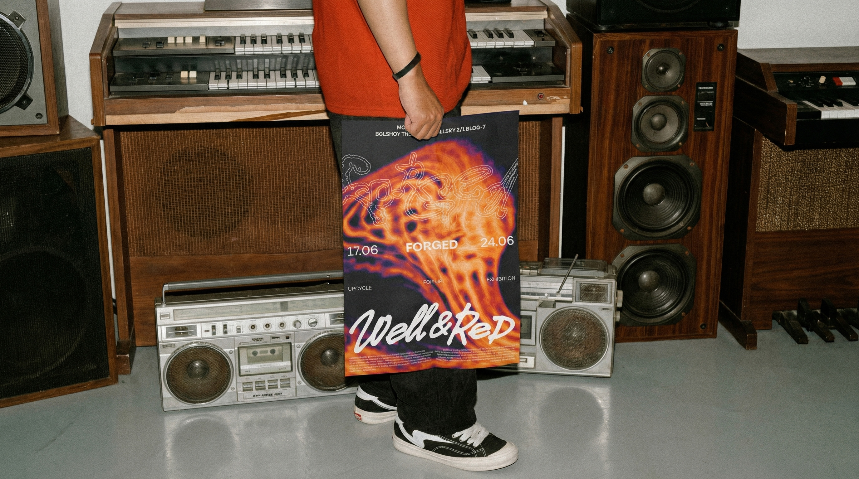
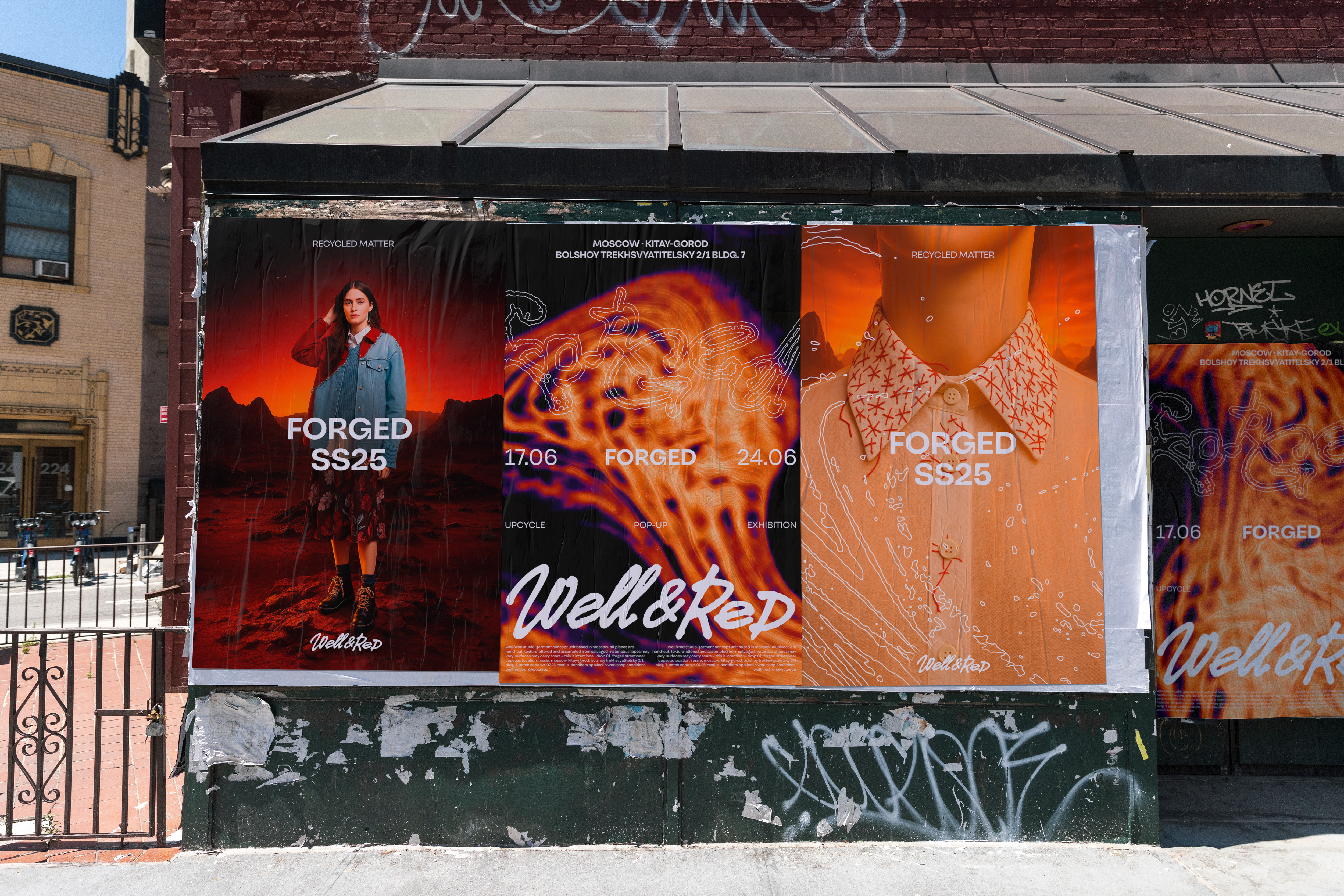
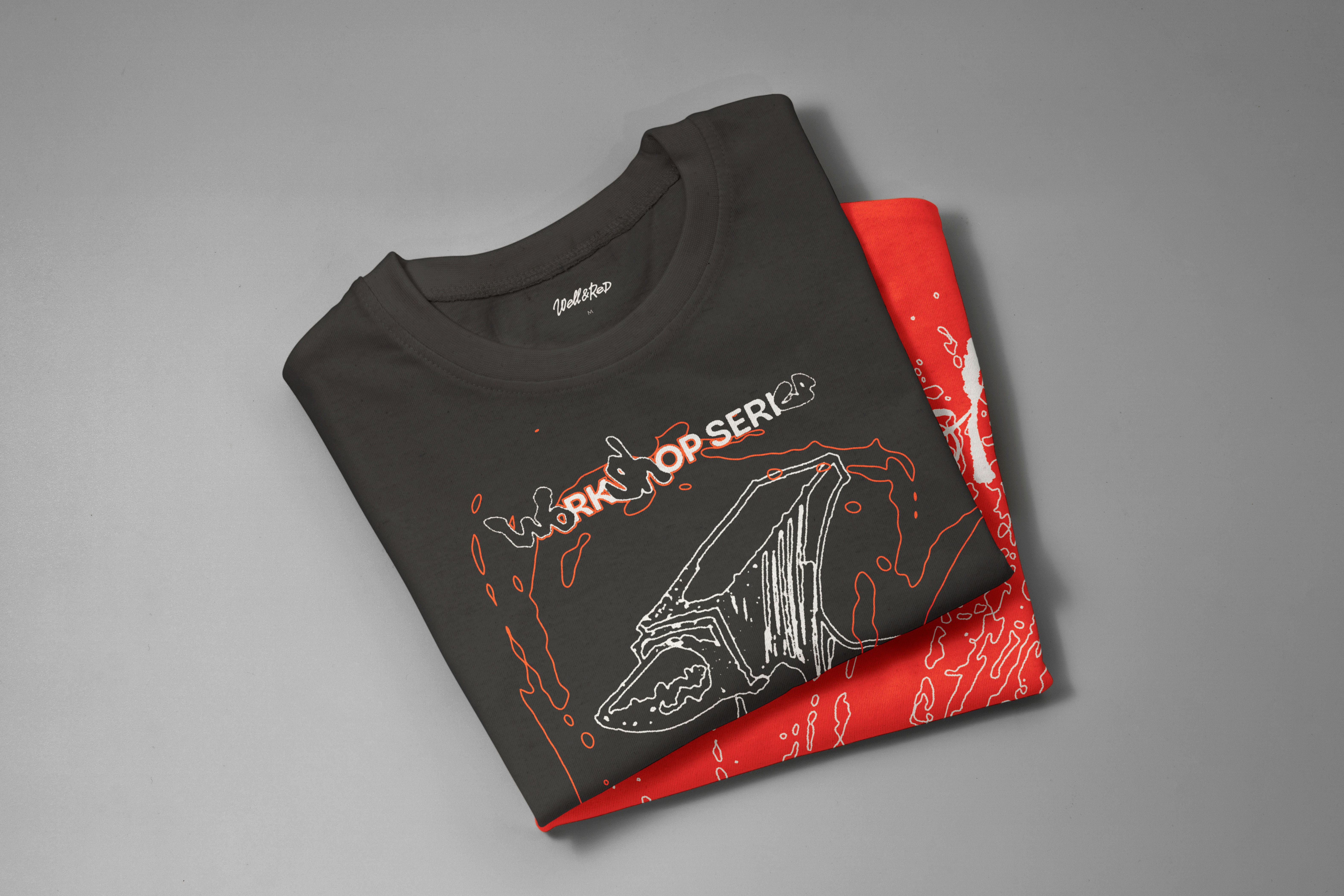
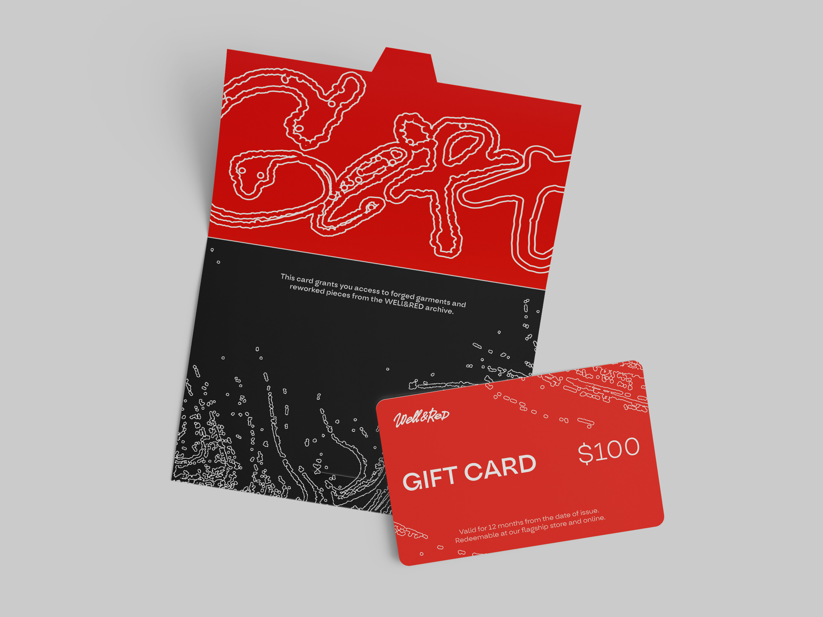
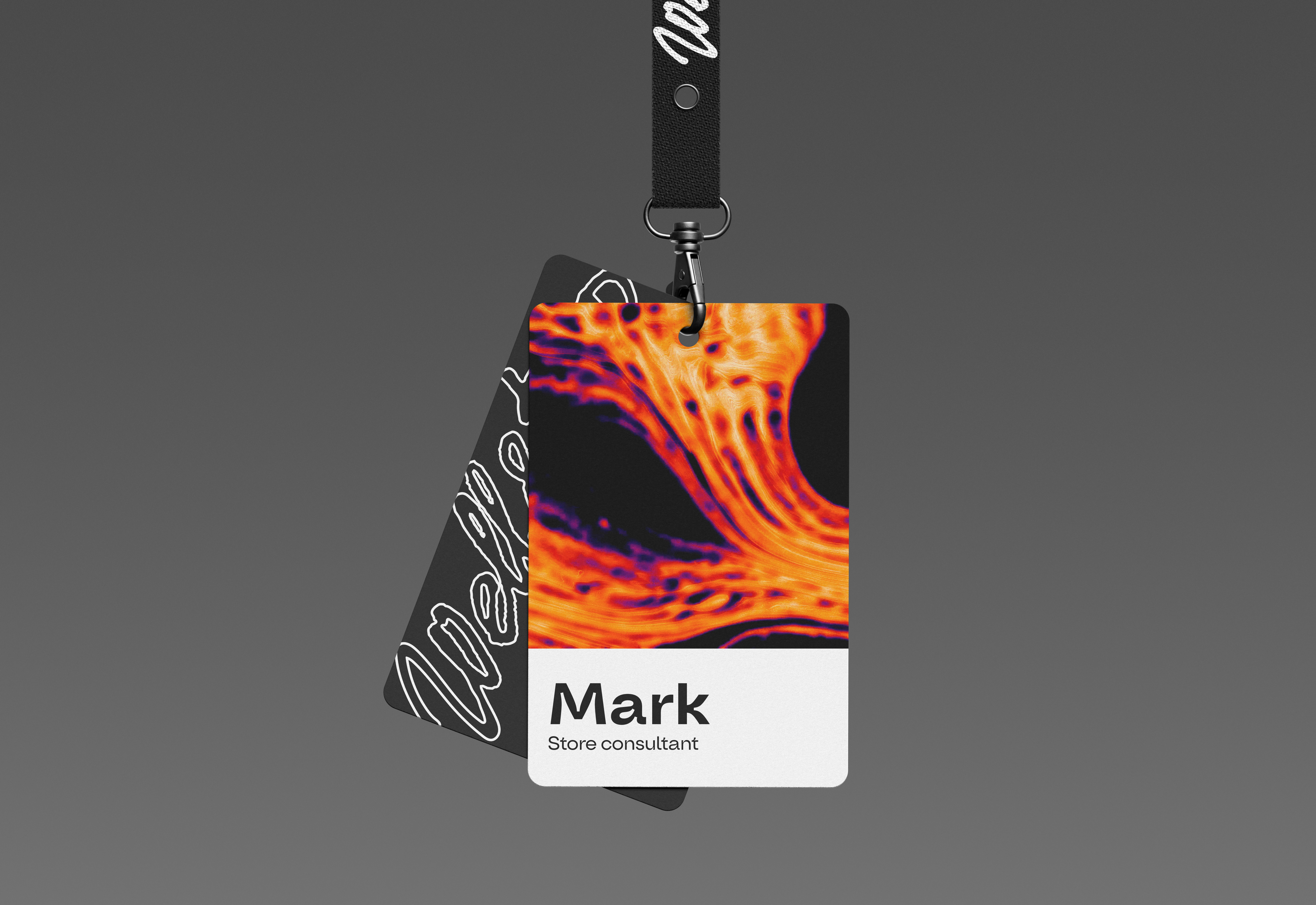
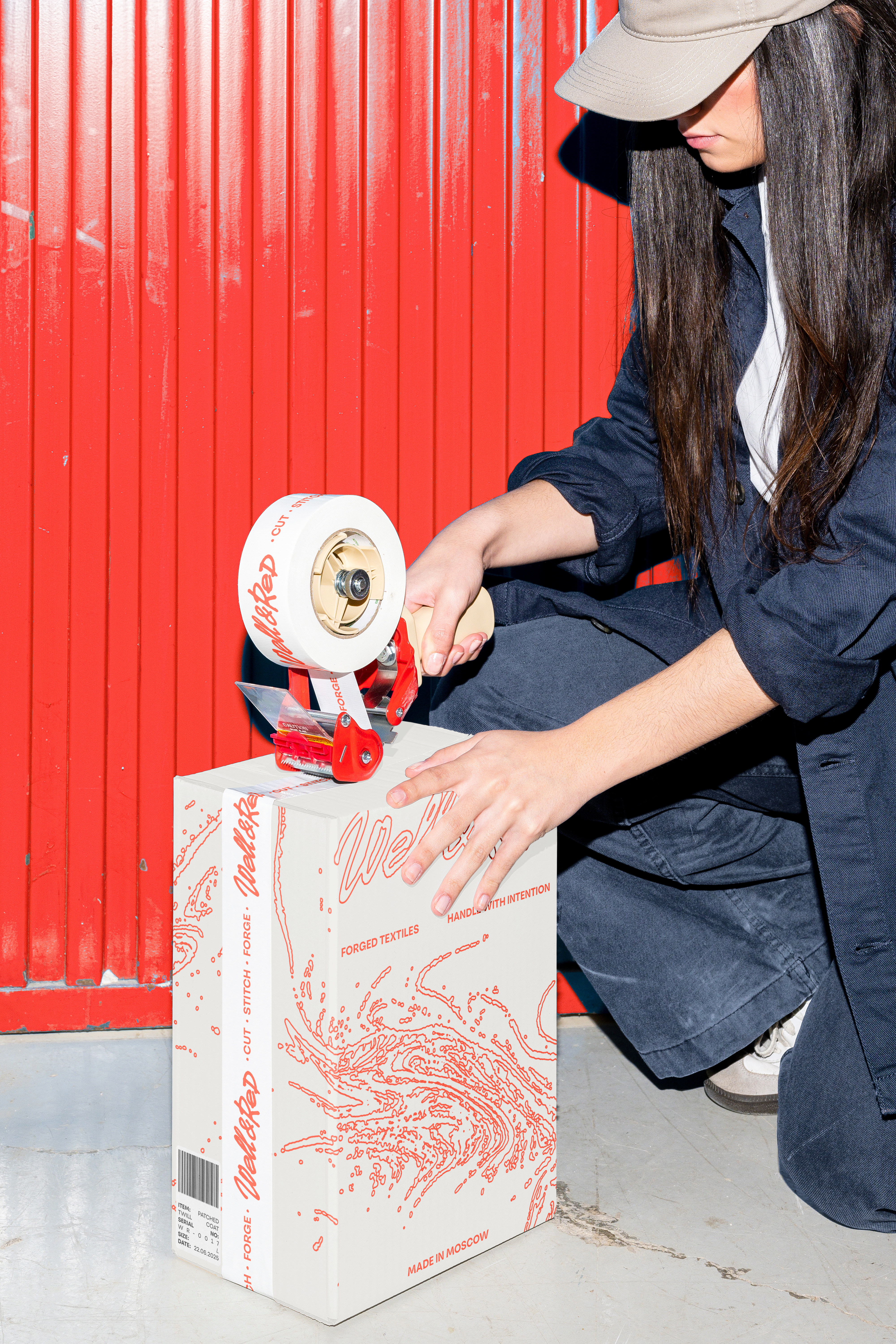
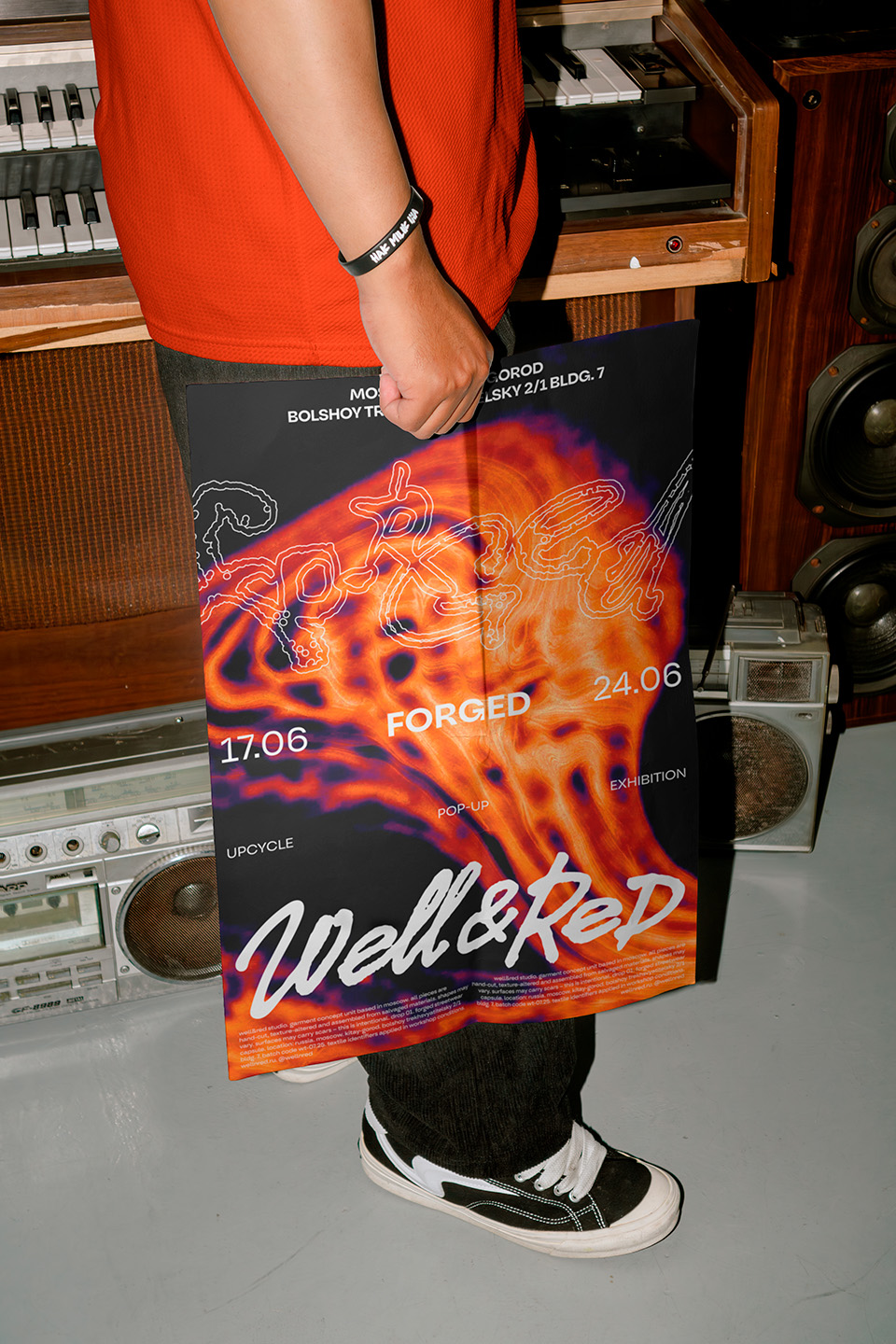
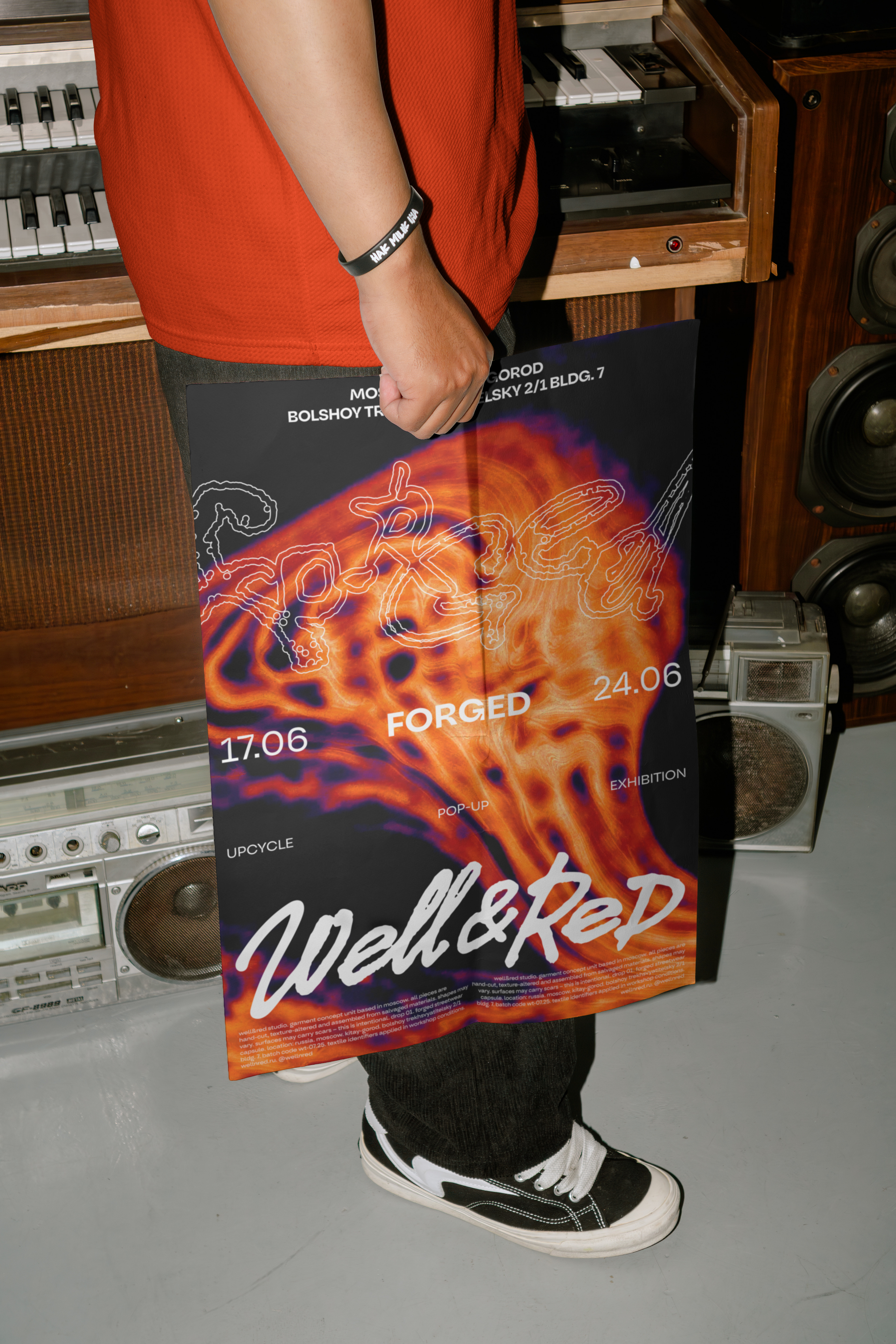
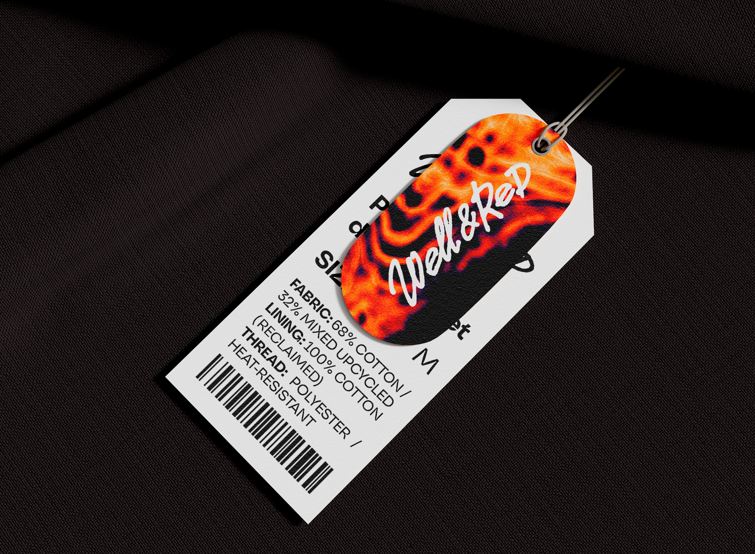
Upcycling was framed as transformation, leading to a visual metaphor based on molten metal, heat, and craftsmanship.
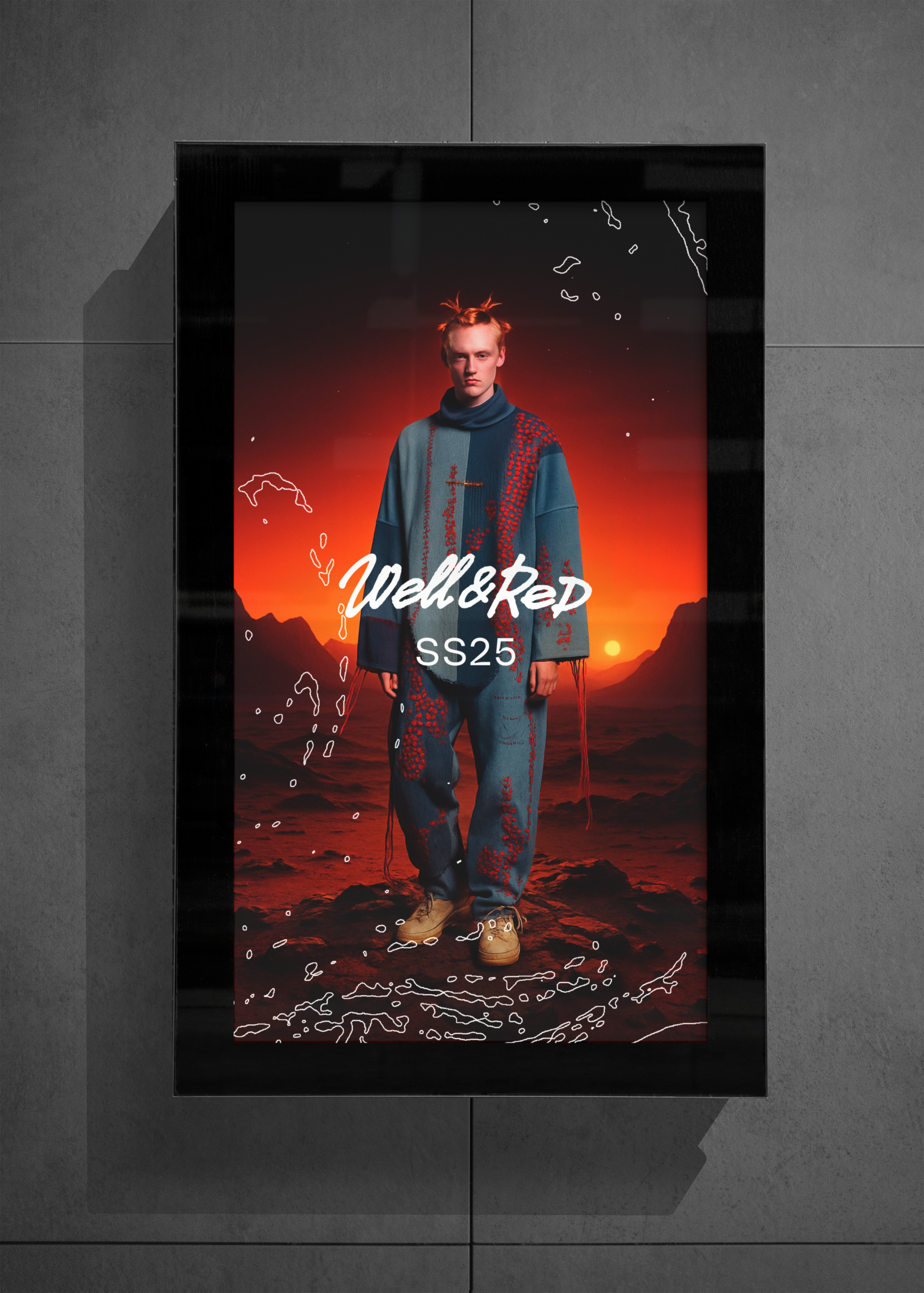
The color palette and photography emphasized energy, motion, and process rather than static product presentation.
The core concept became:
The Art of Reinterpretation — the idea that objects and people can gain new meaning through transformation.
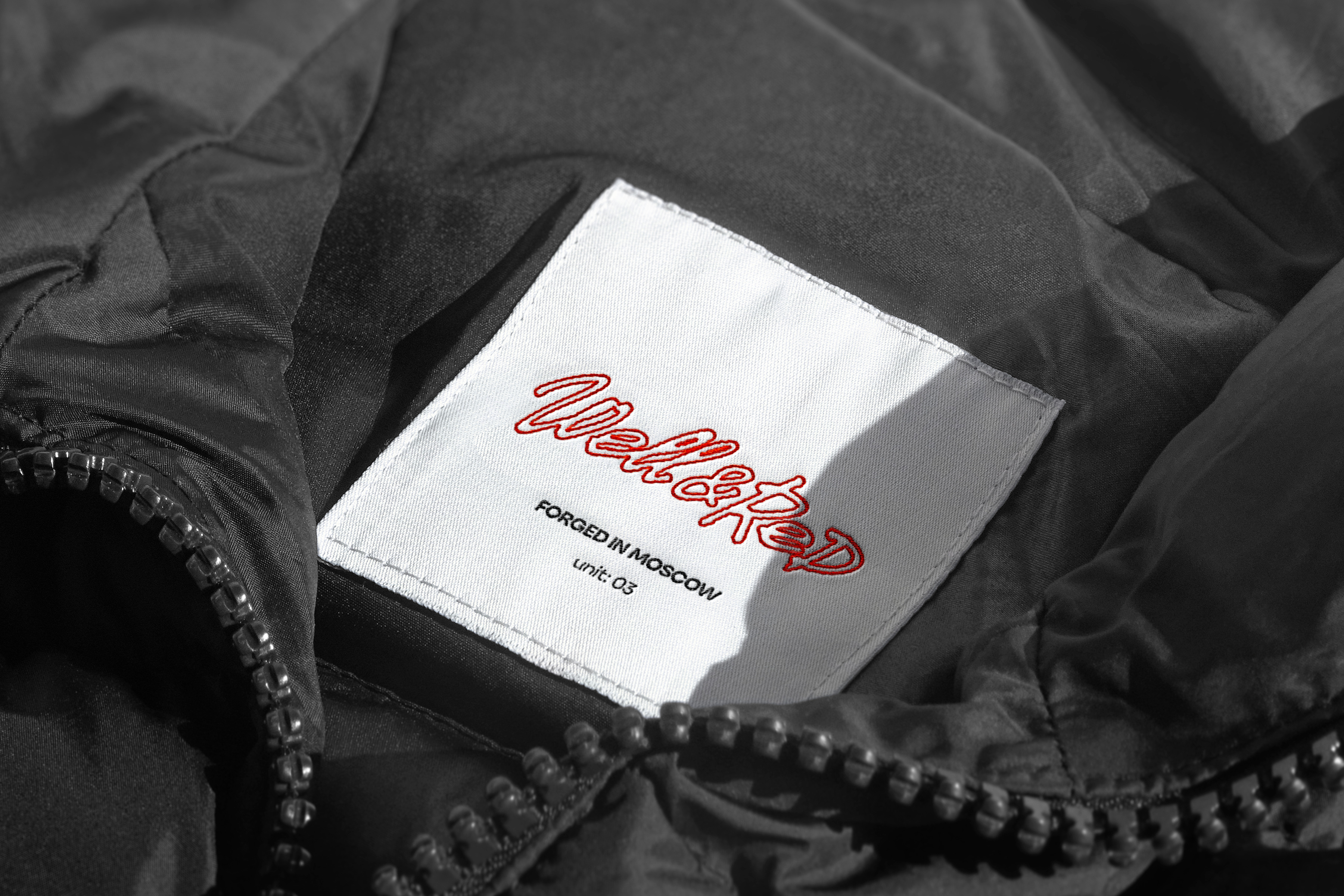
The brief required avoiding direct recycling references. After exploring multiple craft-inspired directions, the concept evolved from WELD & THREAD into WELL&RED:
- WELD — craftsmanship and construction
- RED — heat, fire, transformation
The name communicates both process and emotional intensity.
Two complementary logo directions were developed:
1. A bold, stable version inspired by workshop signage
2. A freer handwritten version resembling an author’s signature
A liquid metal graphic effect was introduced to create a dynamic and recognizable visual language adaptable across media, retail, and motion environments.
Results
WELL&RED emerged as more than a clothing brand — but a creative ecosystem built around transformation and community.
The system supports workshops, collaborations, exhibitions, and seasonal drops, positioning the brand as a cultural statement rather than a traditional eco label.
The result demonstrates how strategy, naming, and visual identity can reshape perception — proving that upcycling can feel like high fashion when reimagined correctly.
GKANNA
Keep Scrolling